ThemesHelper
ThemesHelper allows the host app to perform theme related operations.
Notes:
- Unless otherwise stated, methods in this class require the KeyboardService to be the current active keyboard. Performing operations related to themes without the keyboard started will fail silently, return null or invoke a callback with a null value.
- Reloading a keyboard configuration that has the same theme key as the current one will omit the theme change operation. This does not apply when invoking the changeTheme methods.
Functions
CurrentTheme
Returns the current active theme, if any.
val currentTheme : KeyboardTheme
ChangeTheme [by theme keys]
Changes the current theme to the provided light and/or dark keys in the themes json file.
fun changeTheme(lightThemeKey: String, darkThemeKey: String?)
ChangeTheme [by theme instance]
Changes the current theme to the provided light and/or dark theme instances.
fun changeTheme(lightTheme: KeyboardTheme?, darkTheme: KeyboardTheme?)
UpdateKeyboardColors
Updates the colors for the keyboard layout panel. This theme is automatically resetted when a theme is changed or after calling resetKeyboardColors.
Note:
- This only applies to the keyboard layout (keys and buttons) and won’t affect other UI elements of the keyboard.
fun updateKeyboardColors(theme: KeyboardTheme)
ResetKeyboardColors
Removes any keyboard colors previously set via updateKeyboardColors and applies the previously active theme.
fun resetKeyboardColors()
Enums
ThemeImageType
| SCALE | The image is scaled to cover the keyboard and then is cropped. |
| CENTER | The image is scaled to fit in the keyboard and then is centered. |
Data classes
KeyboardTheme
A class that represents a theme to be applied to the keyboard.
Notes:
- The image file must be located in a device-protected location.
- Adding a keyBackground adds keycaps to all keys and to buttons with background colors. If the keyBackground is not set, no keys or buttons will display a background color.
- Avoid using undocumented attributes, these might change behavior without notice.
data class KeyboardTheme(
    val key: String,
    val name: String,

    val background: Int,
    val backgroundGradient: IntArray? = null

    val image: File? = null,
    val imageAlpha: Float = 1f,
    val imagePosition: ThemeImageType = ThemeImageType.SCALE,

    val keyLetters: Int,
    val keyBackground: Int? = null,
    val keyShadow: Int? = null,

    val hoverLetters: Int = keyLetters,
    val hoverBackground: Int = background,
    val hoverSelectedLetters: Int? = background,
    val hoverSelectedBackground: Int? = keyLetters,

    val suggestionLetters: Int = keyLetters,
    val suggestionSelectedLetters: Int = keyLetters,

    val buttonLetters: Int? = keyLetters,
    val buttonBackground: Int? = keyBackground,
    val buttonBackgroundPressed: Int? = hoverBackground,
    val buttonActionLetters: Int? = buttonLetters,
    val buttonActionBackground: Int? = buttonBackground,

    val spacebarLetters: Int? = buttonLetters,
    val spacebarBackground: Int? = buttonBackground,
    val spacebarBackgroundPressed: Int? = buttonBackgroundPressed,

    val tileIcons: Array<Icon>? = null,

    val keycapSpacingVertical: Float = 5f,
    val keycapSpacingHorizontal: Float = 2.5f,
    val keycapCornerRadius: Float = 6f,
    val keyHoverHeight: Float = 74f,
    val keyHoverWidth: Float = 42f,
    val keyHoverCornerRadius: Float = 3f,
    val keyShadowHeight: Float = 1f,

    val buttonBackspaceLetters: Int? = buttonLetters ?: keyLetters,
    val buttonBackspaceBackground: Int? = buttonBackground ?: keyBackground,
    val buttonBackspaceBackgroundPressed: Int? = buttonBackgroundPressed ?: hoverBackground,

    val spacebarLetters: Int? = buttonLetters,
    val spacebarBackground: Int? = buttonBackground,
    val spacebarBackgroundPressed: Int? = buttonBackgroundPressed,

    val swipeLine: Int = buttonActionBackground ?: keyLetters,
    val trackPadCursor: Int = keyLetters,
    val safeKeyLetters: Int = keyLetters
}
Summary:
| Name | Type | Description |
|---|---|---|
| key | String | The unique identifier of this theme. |
| name | String | A convenience attribute for the name of the theme. |
| background | Int | The background color of the keyboard. Visible when there is no image or gradient, the image alpha is lower than 1, or any of the gradient colors is not fully opaque. |
| backgroundGradient | IntArray? | The background gradient to show over the background color and under an image with alpha lower than 1. |
| image | File? | The absolute location of the background image. It must be accessible to a non-accredited user ( device-protected storage). |
| imageAlpha | Float | The alpha of the background image, between 0 and 1. |
| imagePosition | ThemeImageType | The position and scale of the background image. See ThemeImageType for details. |
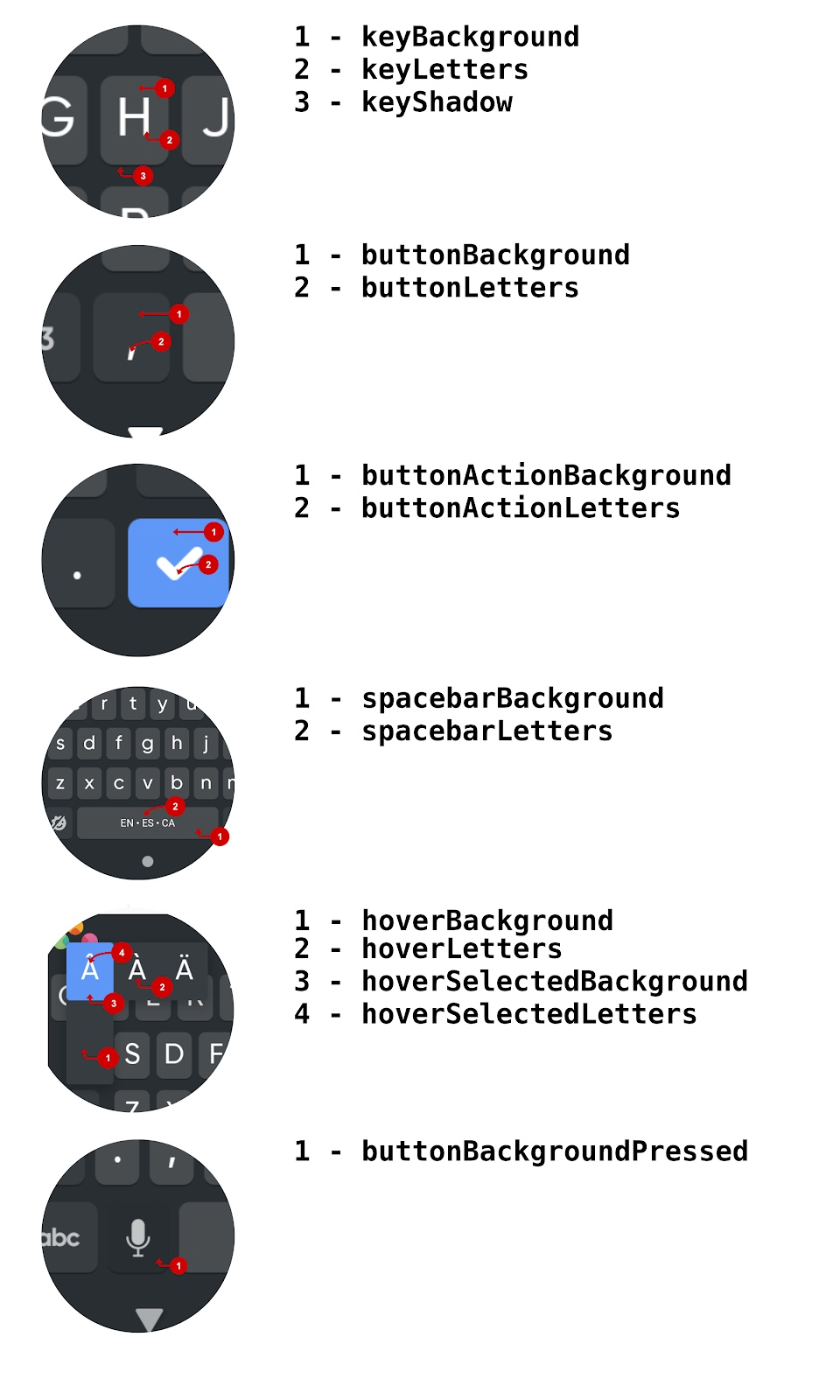
| keyLetters | Int | The color of the key letters. |
| keyBackground | Int? | The color of the keycap in normal keys. |
| keyShadow | Int? | The color of the keycap shadow. |
| hoverLetters | Int | The color of the letters or symbols when long-pressing a key over a hover panel. |
| hoverBackground | Int | The color of the background of the hover panels. |
| hoverSelectedLetters | Int? | The color of the selected hover item letters. |
| hoverSelectedBackground | Int? | The color of the selected hover item background. |
| suggestionLetters | Int | The color of the suggestions text for the non-selected suggestion. |
| suggestionSelectedLetters | Int | The color of the suggestions text for the selected suggestion. |
| suggestionBackground | Int? | The color of the suggestions bar. |
| buttonLetters | Int? | The color of the button letters, symbols or icons. |
| buttonBackground | Int | The color of the background for buttons. |
| buttonBackgroundPressed | Int? | The color of the background for buttons when pressed. |
| buttonActionLetters | Int? | The color of the enter or submit button letters. |
| buttonActionBackground | Int? | The color of the enter or submit button background. |
| spacebarLetters | Int? | The color of the languages and icons that appear on the spacebar. |
| spacebarBackground | Int? | The color of the spacebar background. |
| spacebarBackgroundPressed | Int? | The color of the spacebar background when pressed. |
| tileIcons | Array |
The icon or icons to show when a user hovers over a key. Set to null to use the standard hover bar. |
| keycapSpacingVertical | Float | The vertical spacing around key caps, when keyBackground is set. Unit in DP. |
| keycapSpacingHorizontal | Float | The horizontal spacing around key caps, when keyBackground is set. Unit in DP. |
| keycapCornerRadius | Float | The corner radius of the key caps. Unit in DP. |
| keyHoverHeight | Float | The height of the hover bar when not using custom tile icons, and when the hold mode is set to HoldMode.LAYOUT. Unit in DP. |
| keyHoverWidth | Float | The width of the hover bar when not using custom tile icons, and when the hold mode is set to HoldMode.LAYOUT. Unit in DP. |
| keyHoverCornerRadius | Float | The radius of the hover bar and hold panel. Unit in DP. |
| keyShadowHeight | Float | The height of the shadow below the key caps, when keyBackground is set. Unit in DP. |
| swipeLine | Int | The color of the swipe line when swipe typing is enabled. |
| trackPadCursor | Int | The color of the trackpad cursor. |
| safeKeyLetters | Int | A safe color of the keys that has contrast against the background color, used mostly in keyboard apps. |
Additional computed colors:
| Name | Type | Description |
|---|---|---|
| safeBackgroundColor | Int | A safe background color when the background color might not contrast with the letters color. First available of: - dynamicBackgroundGradient[0] - dominantImageColor - background |
| dynamicBackgroundGradient | IntArray? | The gradient currently in use for a Timelapse effect. Note: the value mutates as it cycles. |
| dominantImageColor | Int? | The dominant color from a user theme image, once the background color and gradients have been applied with their defined alpha. Note: Only available once the image has been displayed after a theme change. |
Icons:
| Icon.TILE | Rounded rectangular tile icon |
| Icon.CIRCLE | Circle tile icon |
| Icon.SQUARE | Square tile icon |
| Icon.HEART_POP | Heart shape tile icon |
Visual Guide of colors: